BizCover Website Redesign
Redesigned insurance experience achieved an 85% CTR uplift on desktop and 157% CTR on mobile, validating the impact of data-informed UX decisions.
Redesigned insurance experience achieved an 85% CTR uplift on desktop and 157% CTR on mobile, validating the impact of data-informed UX decisions.
BizCover NZ provides a digital platform that helps small businesses in New Zealand compare and buy business insurance online. BizCover's website redesign aim was to transform the user experience of NZ/AU premier business insurance comparison platform. The project aimed to improve user engagement, streamline the insurance selection process, and enhance conversion rates through user-centered design principles.
The discovery workshop was a focused get-together with everyone involved to figure out exactly what we're doing with this project, why it matters to the business, and how we'd know if we are in right direction.
The discovery workshop revealed key challenges across business, user, and technical areas.
From a user standpoint, the dated interface and poor mobile experience made the brand feel out-of-touch, while the site was not fully optimised for New Zealand users.
Technically, the website suffered from a 19-second load time and poor performance scores (44 desktop, 26 mobile). Content updates were slow and dependent on developers, limiting agility.
These findings underscored the need for a complete UX overhaul to modernise design, enhance performance, and improve both customer experience and operational efficiency.
I kicked off the research phase by diving deep into understanding our users - their pain points, motivations, and what opportunities we could tap into.
I started digging into analytics, heatmaps, and session recordings to understand how people were actually interacting with the site. This helped in identifying where users were dropping off, getting stuck, or just behaving differently than we expected.
I conducted few user and agent talking sessions to really get into user shoes — what they’re struggling with, what they care about, and what they actually need. These conversations gave a ton of honest insights and uncovered patterns that helped in focusing our UX/UI efforts right from the start.
To get more closer look to NZ insurance market and do some benchmarking I did competitive analysis research across various insurance companies. The analysis was focused on the design, content, and user experience of competitiors website, highlighting strengths and weaknesses. The companies analyzed include Gallagher, State, Tower Insurance, AMI Insurance, and Cactus Insurance.
As we analysed the data, genuine user insights began to emerge-forming a solid base for thoughtful, user-centric design decisions. Using both qualitative and quantitative inputs from diverse sources, we mapped out the core struggles users faced.
Lack of awareness about the risk and insurance protection
Users find Navigation menu confusing and hard to navigate
The site felt functional and transactional, but lacked engagement
Lack of trust indicators like testimonials or ratings or even upfront pricing info
Customers are more inclined towards pricing before getting into the funnel
Long, excessive and poorly organized content leading to frustration and drop-offs
Site was not optimized for mobile users leading to major drop-offs
Some sections of website were failing accessibility
Mapping encourages open, creative thinking where all ideas-big or small-are explored without judgment. It helps teams uncover innovative solutions and challenge assumptions. Prioritization brings structure by evaluating each finding based on impact, feasibility, and alignment with project goals.
The development of the website is guided by the following principles to ensure user value and effectiveness.
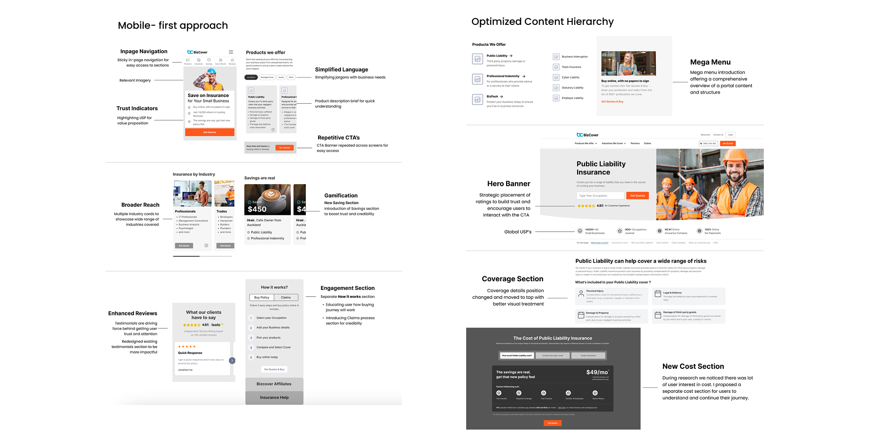
Group links in a way so that it is easy for user to find relevant information on the screen.
Clearly communicate the unique value proposition of the business insurance offerings.
Recommendations & customizations to enhance user engagement & satisfaction.
Displaying trust indicators to reinforce credibility and reliability.
Responsive design principles to adapt the layout and features across different screen sizes.
Based on the research findings and prioritised insights, we conducted brainstorming sessions to explore multiple design concepts addressing key user pain points. These collaborative sessions involved close discussions with stakeholders during weekly check-ins, ensuring that business goals and user needs stayed aligned. Through this iterative process, several wireframe ideas were developed, refined, and validated collectively—forming the foundation for the final design direction.
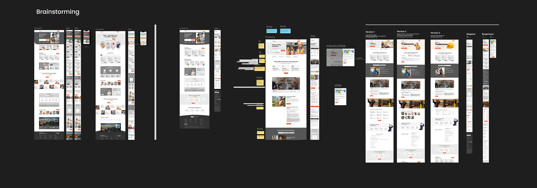
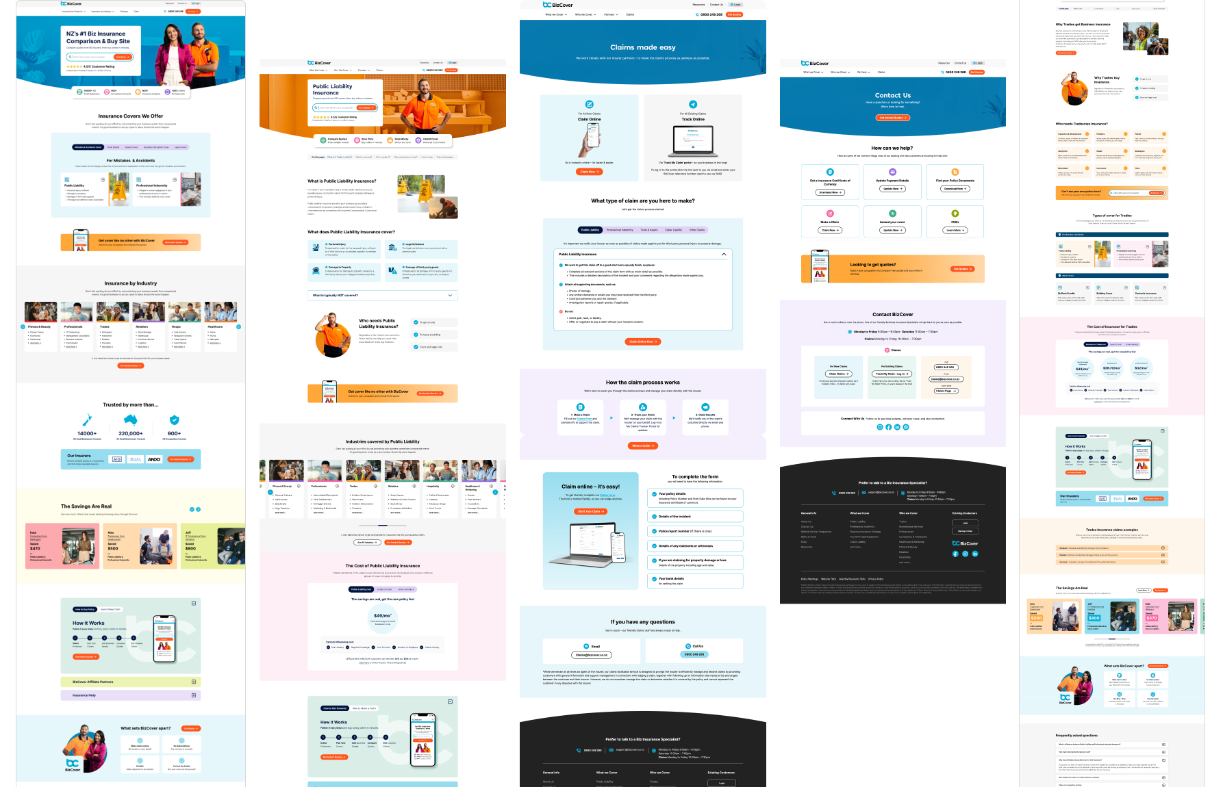
The final wireframes represent the refined outcome of multiple design iterations and stakeholder feedback. Each element was carefully aligned with user insights, business goals, and accessibility standards to ensure a seamless and intuitive experience.
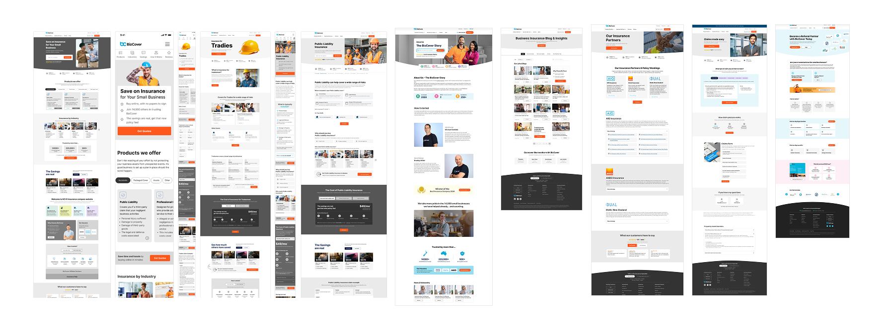
The final visual design translated the approved wireframes into a cohesive, modern interface that balanced aesthetics with usability. The visual language focused on clarity, consistency, and accessibility, ensuring users could navigate key workflows with ease. A clean color palette, readable typography, and thoughtful use of whitespace helped create a professional and approachable experience that aligned with the brand’s tone and purpose.
This approach ensured that the most critical user journeys—such as viewing KPIs, tracking progress, and performing quick actions—remained intuitive and fast-loading on mobile devices. Every component was optimised for touch interaction, legibility, and adaptive spacing, providing a seamless experience across varying screen sizes and orientations.
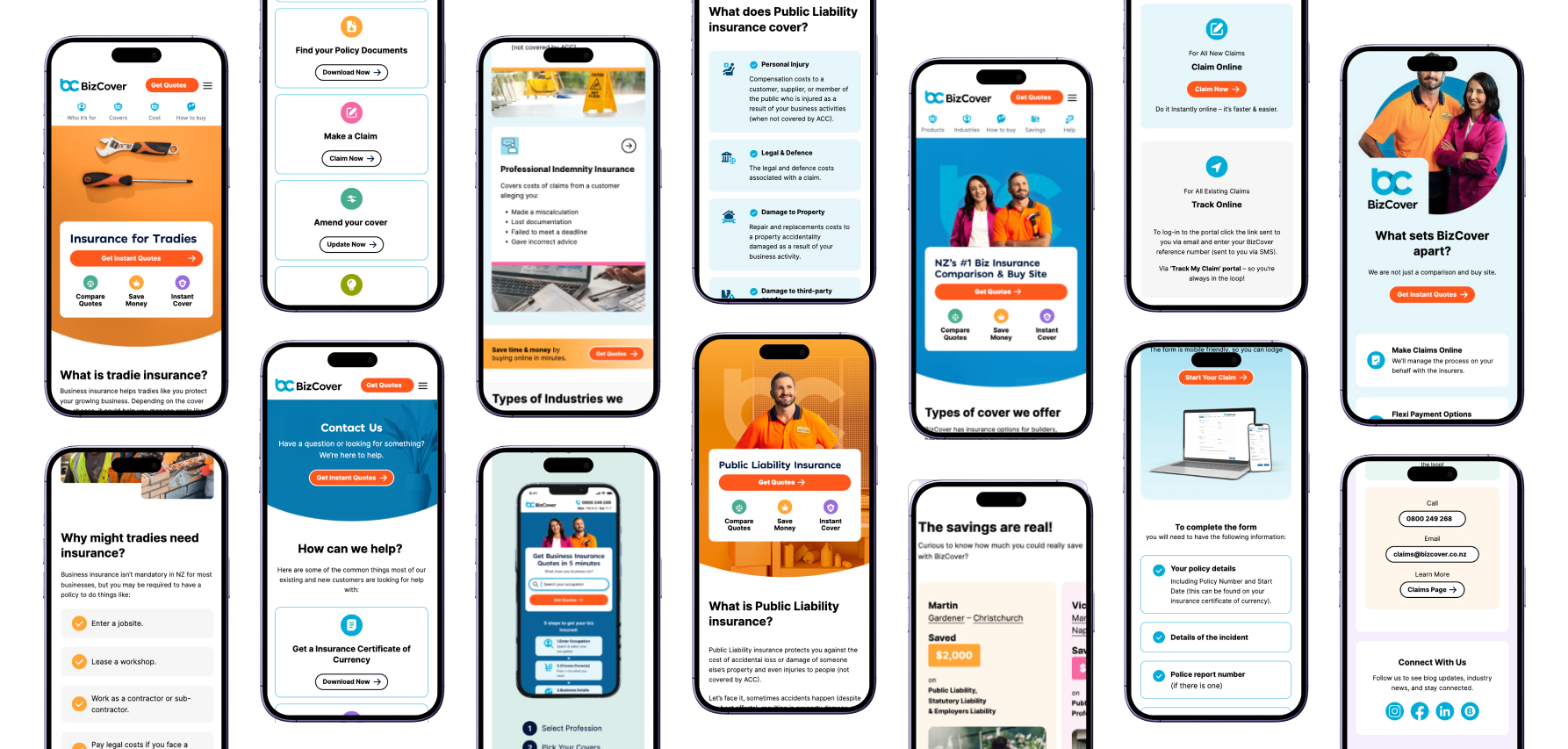
Grid-based structures, scalable typography, and adaptive components allowed the interface to adjust effortlessly across devices. The desktop views provided enhanced visibility for coverage, gamification, and broader features, maintaining consistency while optimising for productivity and clarity.
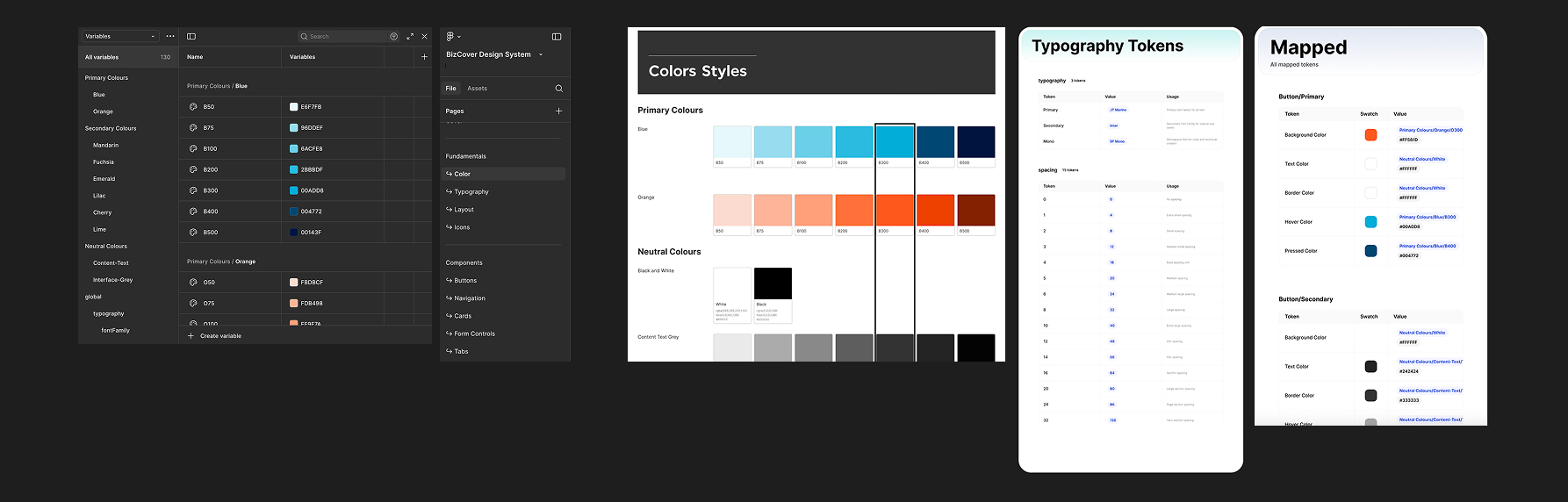
Design tokens defined key attributes such as color, typography, spacing, and component states, creating a single source of truth for both designers and developers. This systematic approach enabled faster iteration, easier theming, and improved collaboration-ensuring that future design updates remain consistent, accessible, and efficient to implement.
After monitoring website performance for one month after the launch. The redesigned experience led to measurable improvements in user satisfaction and business metrics.
I'm always interested in discussing new opportunities, collaborating on exciting projects, or simply sharing ideas about design.