Iptor CRM Application
Unified customer experience and opportunity management system resulted in 40% increase in overall efficiencies.
Unified customer experience and opportunity management system resulted in 40% increase in overall efficiencies.
I worked for Harman's Europe based client- Iptor on their CRM Application. This Unified Platform offers a consistent and user-friendly experience for teams across organization. Organizations can leverage a centralized platform for communication, task management, project collaboration, and more, fostering seamless teamwork and improved productivity. CRM is available for deployment of customers choice either Cloud or On-premise. Harman design agency was consulted to transform their digital customer experience.
Post release of app led to measurable improvements in user satisfaction and business metrics.
I kicked of the research phase by diving deep into understanding our users - their pain points, motivations, and what opportunities we could tap into.
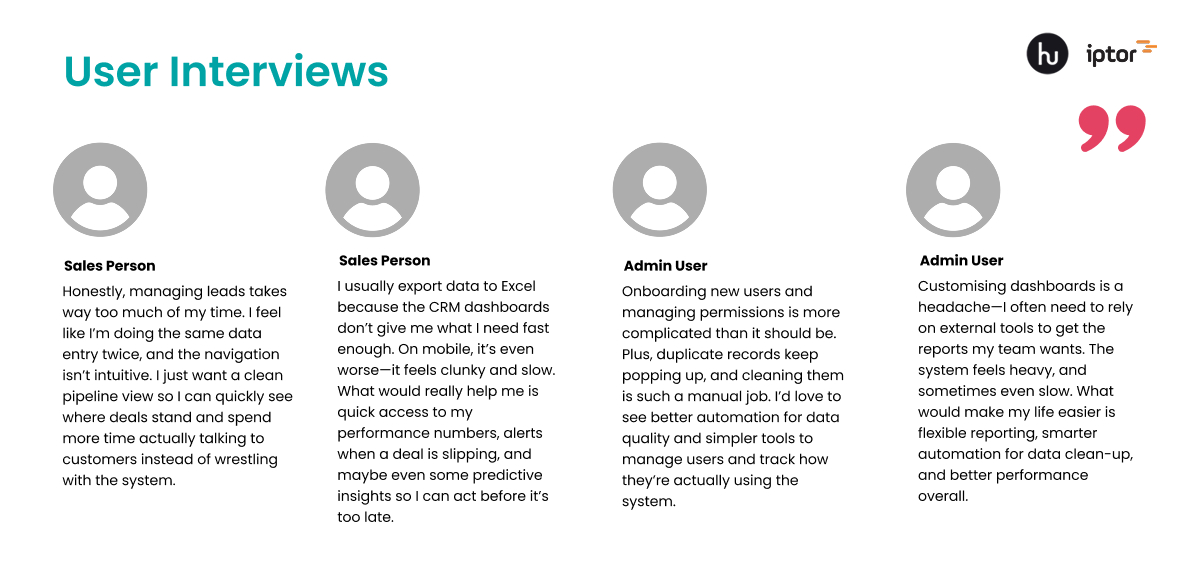
I collaborated closely with the client to identify user pain points and expectations. Through a series of stakeholder and user discovery workshops, we deep dived into deeper understanding of the application, usage and users. The client provided valuable assistance and insights, enabling us to fully understand the product's purpose and its intended market impact.
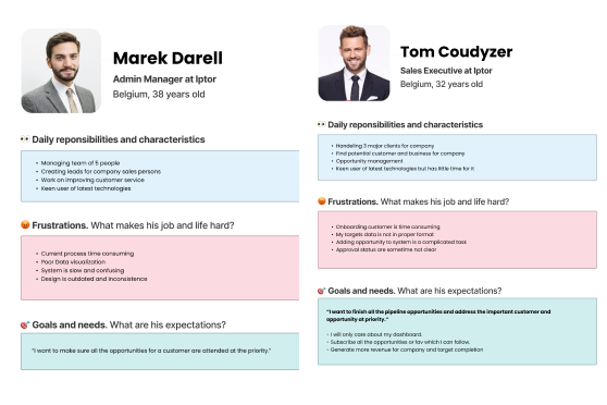
Following an analysis of user behavior and mental models, I developed user personas to represent the primary user groups
Before diving into design solutions, I took time to understand the real challenges users were facing. I identified several friction areas that were impacting productivity, usability, and overall satisfaction for both field users and admin staff. These pain points helped shape our priorities and guided key decisions throughout the design process.
Multiple interfaces requiring extensive training for new team members
Users constantly switching between different applications disrupting workflow
Implement global search across all platform data
Develop intuitive navigation structure reducing context switching
Prioritized responsive design for field team accessibility
Based on our research findings, I started on the mapping to create journey map, Feature MVP, and IA. I iteratively refined these artefacts through multiple feedback sessions with stakeholders and users.
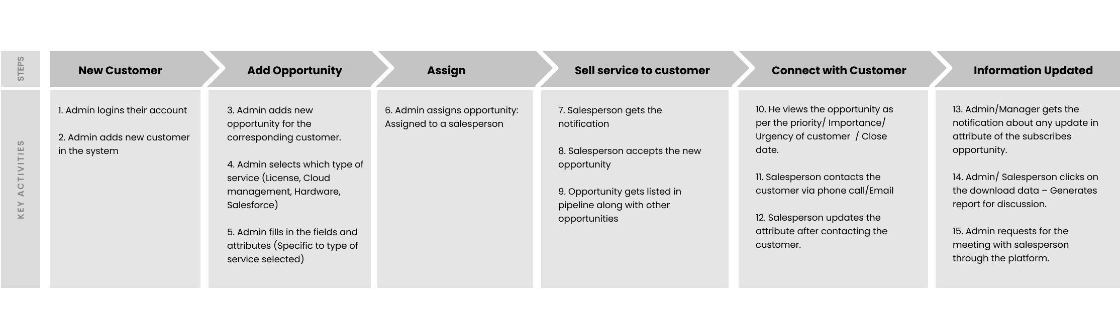
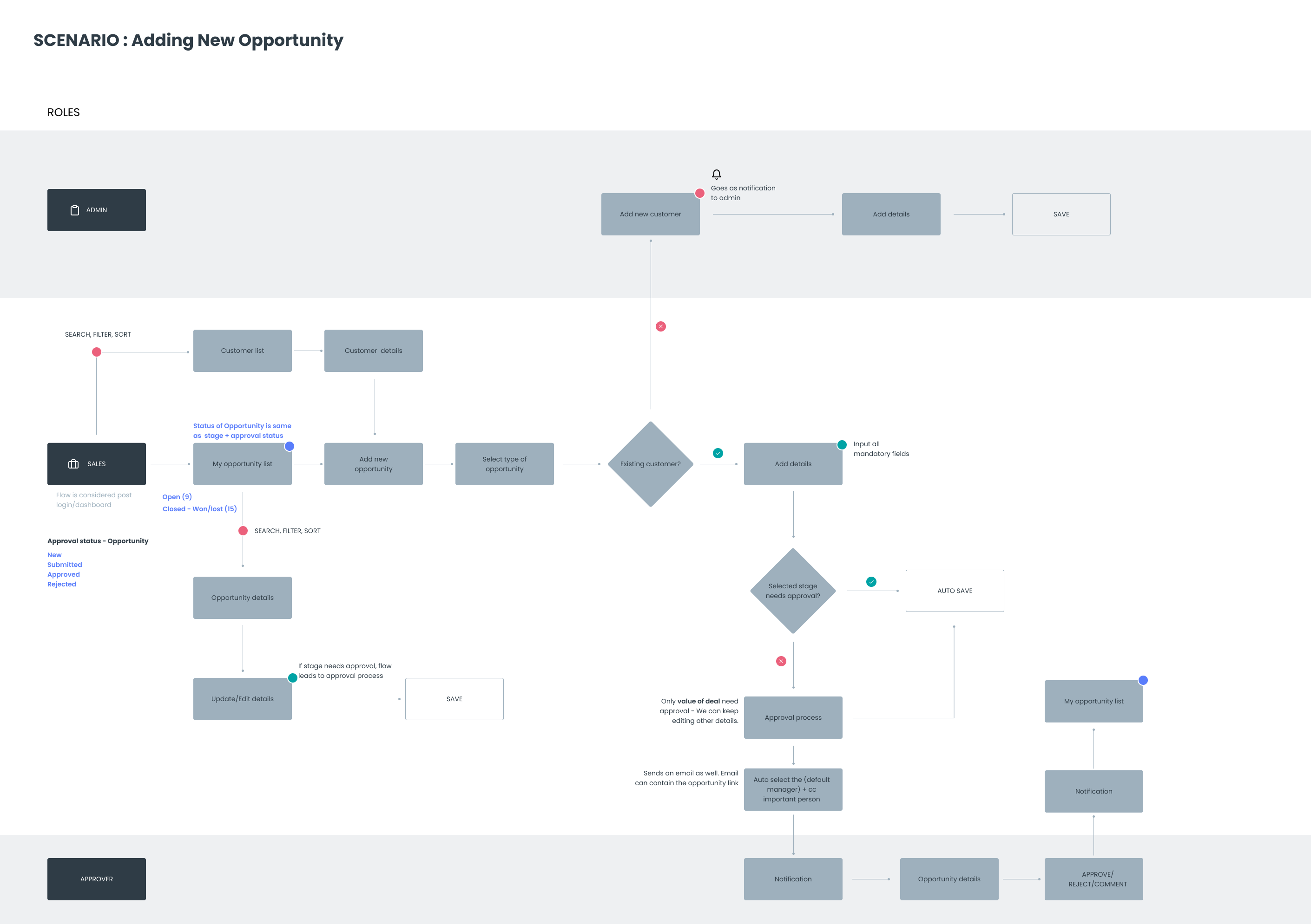
I created a journey map outlines the typical day of a staff and how they manage their daily tasks. The journey map gave us a broad view of how users interact with the product and business at different points. It helped us steps involved, find friction points, find opportunities, and tackle those pain points.
I created a feature map to decide what should go into the MVP, focusing on the essentials—features that truly mattered to users and aligned with business goals.It kept us on track, helped avoid unnecessary add-ons, and made sure team was building something valuable while staying within the defined scope and timeline.
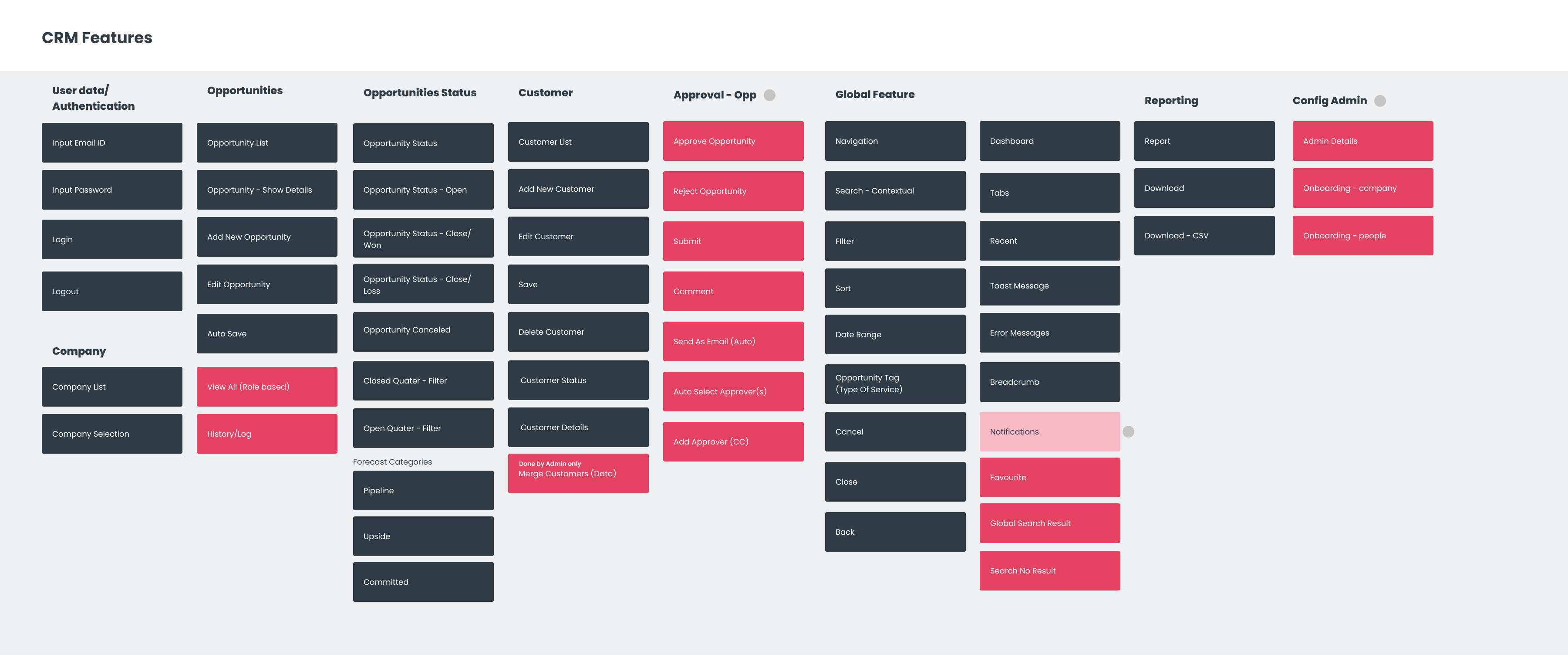
I created a draft Information Architecture (IA) to map out how key features and content would be organized. Sharing this early structure with users helped us validate how they expected to navigate the system—ensuring we were on the right track before moving into detailed design.
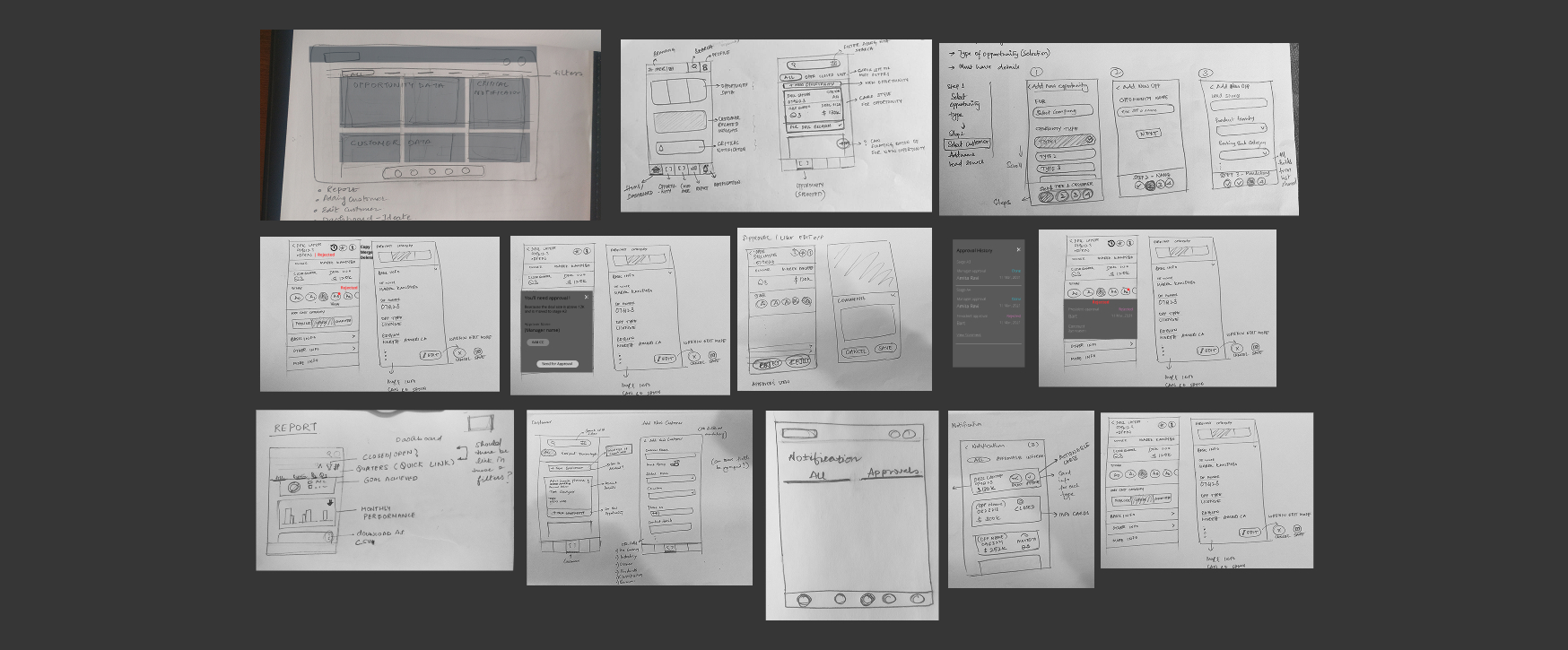
Project timeline were very tight, due to this time constraint we took the paper sketche wireframe approach. This helped us quickly putting out quick and dirty ideas on paper. The wireframing and visual design were heavily influenced by user feedback, with iterative design and constructive feedbacks though click-through prototype helped us in ensuring the product meets the needs and expectations of the target users. The focus was on creating an intuitive, efficient, and visually appealing interface that supports seamless workflows.
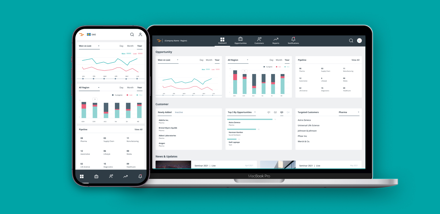
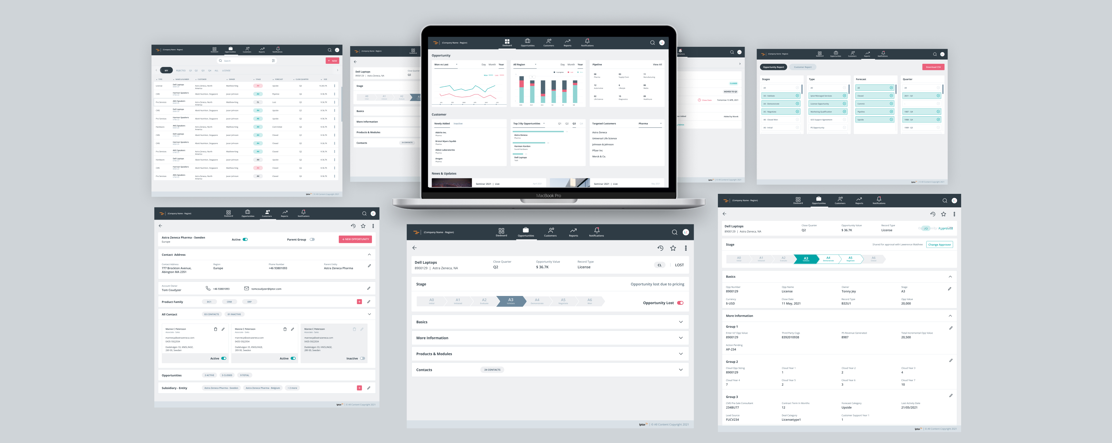
At-a-glance view of sales activities, customer interactions, and performance metrics.
Be more prepared and responsive, improving relationships and trust with customers.
Capture notes, follow-ups, and deal progress without delays.
Able to view, add and update customers records easily.
Access sales reports anytime to track progress and adjust strategy.
The final visual design translated the approved wireframes into a cohesive, modern interface that balanced aesthetics with usability. The visual language focused on clarity, consistency, and accessibility, ensuring users could navigate key workflows with ease.
Salespeople are constantly on the move—whether they're out in the field, meeting clients, or in between calls while driving. Because of this fast-paced and mobile nature of their job, accessing the CRM on a mobile device is essential. It allows them to quickly check customer details, update notes, and manage leads without needing to sit at a desk, making their workflow much more efficient and responsive. Access on mobile heavily impacted sales people productivity.
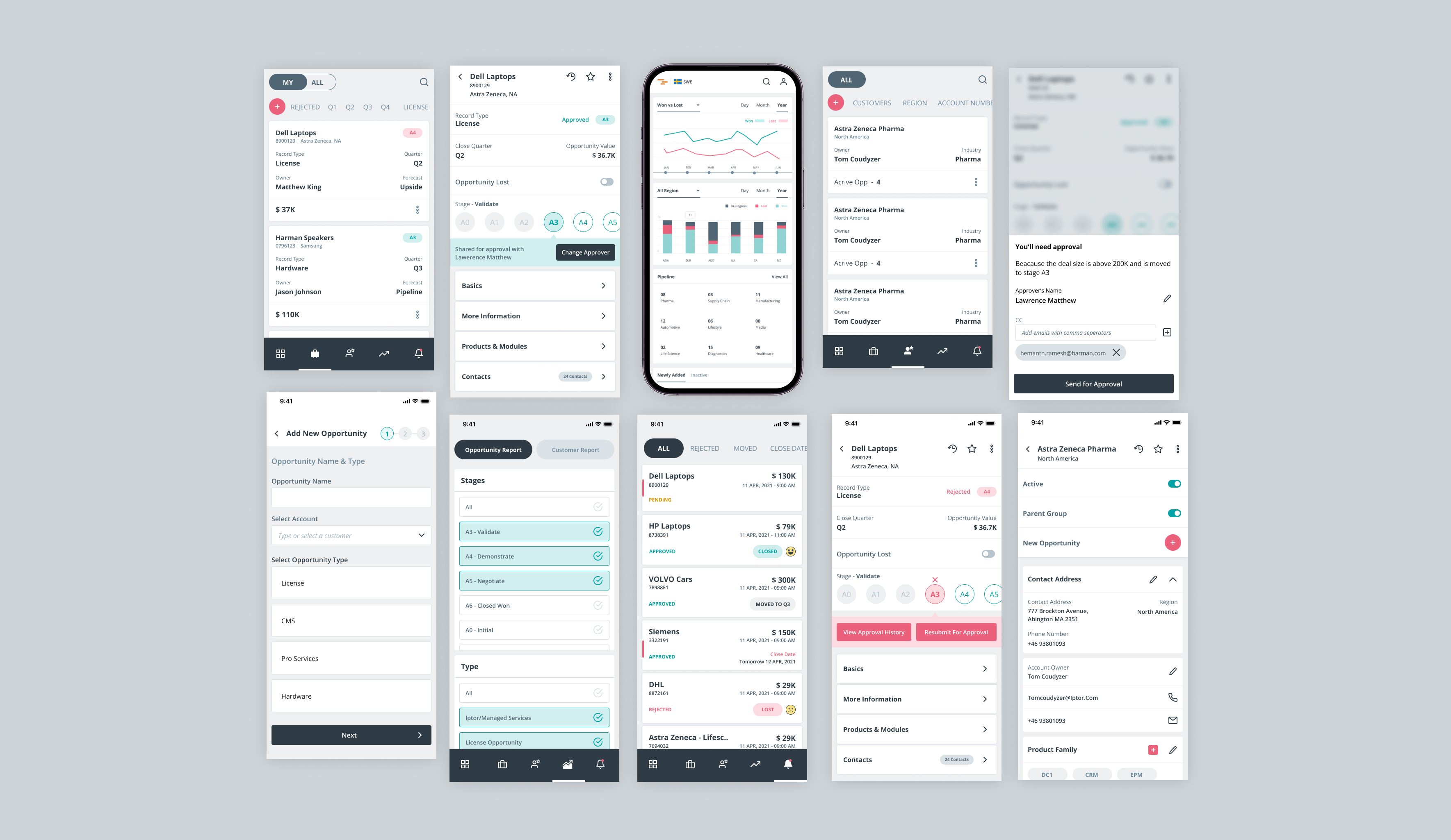
Admins and managers found the intuitive dashboard and quick access to information extremely helpful. One of their biggest pain points was the complex customer onboarding process, which we streamlined in the new design to make it much easier. Managers especially appreciated the updated approval workflow- it allowed them to quickly review details and give feedback or approvals without any hassle.
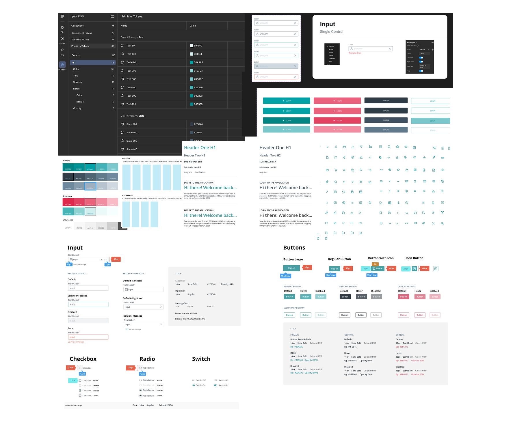
To ensure visual consistency and scalability across the web and mobile platforms, a comprehensive design system was developed. It established the core design principles, visual language, and reusable components that formed the foundation of the product’s interface.
Post release of app led to measurable improvements in user satisfaction and business metrics.
I'm always interested in discussing new opportunities, collaborating on exciting projects, or simply sharing ideas about design.